Hey everyone! Notice anything different around here? As I mentioned a couple of months ago, I’ve been trying to revamp my blog and make it more unique and reflective of my own style! I’m so excited to show you my newly updated blog and explain the process behind it!
I started “All About Ami” about three and a half years ago on tumblr, and I remember I was so excited to choose a blog template back then. I ended up going with “Royal Ribbon”, a free template by Simon Fletcher designed in 2010, and I loved the clean grey and pink theme that looked very classy. However, as time went on, I wished that I had a sidebar, and I found out that this could not be implemented easily if it was not a part of the theme. I also came across many others who used the exact same theme as me, so I didn’t feel very unique! I was itching to redesign my blog but it always seemed so daunting, especially for someone with very limited html knowledge!
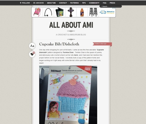
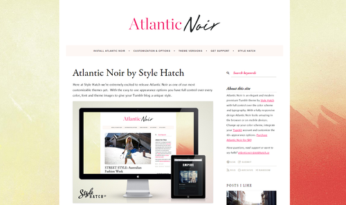
A couple of months ago I started looking into different tumblr themes to see what was out there. I really wanted to stick with tumblr since it has been such a supportive community for me, but I was a bit dismayed that there seemed to be fewer options for blog templates and customization options compared to Blogspot or WordPress. However, I came across a tumblr theme that I really liked called “Atlantic Noir” designed by Style Hatch. It’s a premium theme ($49) that allows for a lot of customization options. I loved how it had the traditional blog look with the sidebar. Ontop of that, Jonathan Moore, the founder and creative director of Style Hatch, was extremely quick and responsive to all my e-mails, so this gave me the confidence to go ahead with this theme since I knew I would have support! This is what the default “Atlantic Noir” theme looks like:
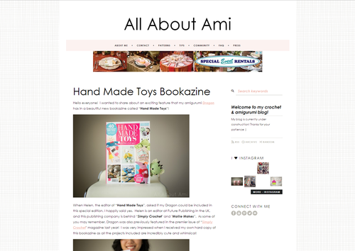
I purchased “Atlantic Noir” over the weekend, and I didn’t know that it would be implemented right away! My heart skipped a beat and I tried to revert back to my old “Royal Ribbon” theme but alas, I could not find it as I do not think it is available anymore. Trying not to panic, I quickly tried to work on all the changes little by little. I actually started feeling nostalgic and missed my old template since I had used it for 3.5 years! Thank goodness I had taken some screenshots last week so I could remember what it looked like! If you visited my blog on Saturday evening, you may have seen some wonky things happening! I changed the font and colours, deleted some items from the sidebar, and added my own background (check out “michLgstudios” on Etsy HERE for some beautiful blog backgrounds). I was still waiting for my final graphics, so this is what my blog looked like without the header and welcome button:
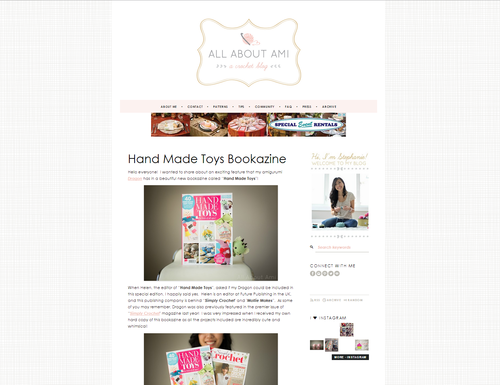
I hired Leonora of “Yellow Heart Art” to design my header, logo and buttons. I love her work (check out her Etsy store HERE and her blog HERE) and am so happy with how everything turned out. I wanted to have a pink, grey and gold colour palette as I think it looks very pretty and classy! Below you can see how adding the header and welcome button changes so much!
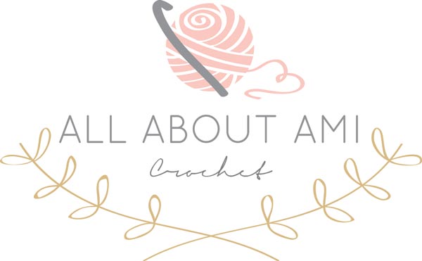
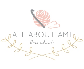
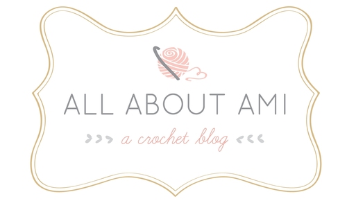
For my logo, I really wanted to incorporate a crochet hook and a ball of yarn. I love what Leonora designed and how the strand of yarn is in the shape of a heart! We also added some gold leaves to help frame the logo and tie in the colour scheme.
For my header, I wanted to include a subheader/tagline saying “a crochet blog” in case people didn’t know what “All About Ami” was about! The little sideways hearts also represent crochet stitches (like the ‘v’s consisting of a front and back loop) and I love how Leonora included them in the header and in my welcome button too!
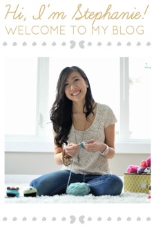
I wanted to have some sort of welcome button that also introduced myself in case people don’t click my “About Me” tab! Many people still think my name is “Ami”, haha. We’ve been meaning to take a new profile pic, but we haven’t had the time! I’ll add an updated one once we’ve taken it 🙂
Leonora also made these pretty pink social media buttons on my “Contact” page! They’re actually not functional yet but I’m hoping they will be soon!
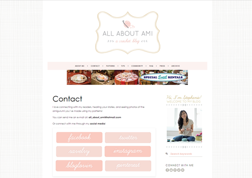
I have had so much fun trying to redesign my blog and I am incredibly happy with how it has turned out! I think it has an airy and elegant feel to it and is definitely more reflective of my style. It’s been fun putting our own touches on it so now it does not look like any other blog! I wanted to extend a big thank you to Leonora and Jonathan for all their help, and also to Ryan who has helped me envision this along the way! There are still changes to be made, but I’m excited with how it’s coming along. I would LOVE to hear your feedback about what you think of this new redesign! Thanks so much for all your support throughout the years!
